- 19 Mar 2025
- 1 Minute to read
- DarkLight
TCPA KPI Dashboard
- Updated on 19 Mar 2025
- 1 Minute to read
- DarkLight
Summary
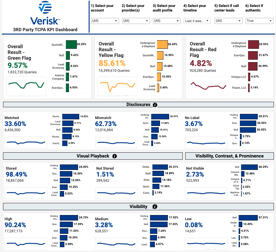
The 3rd Party TCPA KPI Dashboard provides an at-a-glance overview of the compliance characteristics of your leads and lead providers. It includes directional arrows to represent an increase or decrease in leads of a particular category compared to a previous timeframe. It features color-coding for easier interpretation of lead compliance and facts about lead distribution.

Sections of the Dashboard
Overall Flag Result - Shows the overall and trending percentage of leads flagged as Green/Yellow/Red based on your account's flag settings in the Jornaya Member Portal
Disclosures - Shows the overall and trending percentage of leads that matched, mismatched or had no label. Hover over the info button in the section heading for a detailed definition of each.
Visual Playback - Shows the overall and trending percentage of leads for which a Visual Playback was available
Disclosure not visibile - Shows the overall and trending percentage of leads where an approved disclosure was witnessed but that disclosure was not visible to the consumer
Disclosure visbility low/medium/high - Shows the overall and trending percentage of leads where an approved disclosure was witnessed and how visible the disclosure was to the consumer. This metric is an aggregate of the contrast and prominence metrics.
Contrast - Shows the overall and trending percentage of leads where an approved disclosure was witnessed and the level of contrast associated with that disclosure. This is an indicator of how visible the disclosure was to the consumer on the inquiry form.
Prominence -Shows the overall and trending percentage of leads where an approved disclosure was witnessed and the level of prominence associated with that disclosure. This is an indicator of how visible the disclosure was to the consumer on the inquiry form.
Sparklines
Every KPI on the dashboard features a corresponding sparkline to show how that KPI has trended over the selected time periord. The sparkline dynamically adjusts with the selected relative timeframe and other filters.
You can hover over a specific day, week or month in the sparkline to see overall results for that given timeframe as well as a Top 5 provider breakdown.

